System Overview
Getting Started
New to CaliberMind - Start Here!
CaliberMind Home Page & Navigation
Signing In to CaliberMind
How do I use CaliberMind's search functionality?
Company or Account Detail - Search Results
Campaign Detail - Search Results
Person Detail - Search Results
Opportunity Detail - Search Results
How Does CaliberMind Define a "Channel"?
What Is a CaliberMind Event or Event Table?
How to use Dashboards
Connectors / Integrations
CaliberMind Connectors - Start Here!
Overview of Connectors
Adding Your First Connector
CaliberMind Connectors
How to Connect: Act-On
How To Connect: AdRoll / RollWorks
How to Connect: G2, Bombora, or 6sense
How to Connect: Google Ads [via FiveTran]
How To Connect: Google Analytics
How to Connect: Google Sheets
How To Connect: HubSpot
How to Connect: Klaviyo [via FiveTran]
How To Connect: LinkedIn Ads
How To Connect: Marketo
How To Connect: Microsoft Dynamics
How To Connect: Outreach
How to Connect: Pardot [via FiveTran]
How to Connect: Salesforce [via FiveTran]
How to Connect: Segment [via FiveTran]
How to Connect: Twitter [via FiveTran]
How to Connect: ZoomInfo / DiscoverOrg
Kickfire
Setting Up the LinkedIn Push Connector
Setting Up the Salesforce Push Connector
Power BI/ Tableau/ Looker Connectors Article
Connecting Your Data Warehouse to CaliberMind - Start Here!
Connecting Tableau to CaliberMind
CaliberMind Data Export to Google Cloud Storage
Ingesting CaliberMind Data Into Snowflake
Pushing CaliberMind Person Engagement Data to Salesforce
Integrations Appendix by Connector
SFTP Connector - Updated 2021
Replicating CaliberMind Attribution Data to Salesforce
How to Connect Facebook Ads
KickFire De-Anonymization in CaliberMind
Field History SFDC Limits (Salesforce)
SFTP Synced Files - Making a Data Change
Connections - Email Notifications
CaliberMind Data Access FAQs
Microsoft Bing Connector
Bing/Microsoft Ad's Connector
Connector Health and Web Tracker Health reports
Connectors Status Page
In-App Notifications
CaliberMind IP Addresses for Whitelisting
Developer Guide
Developer Guide - Start Here!
CaliberMind Entity Relations and System Tables
What is Google BigQuery
CaliberMind Common Data Sources
CaliberMind Identity Levels
System Configuration
Object Mapping for Filters - Start Here!
Custom Configuration for Object Mapping
Object Mapping Filters
How to Map Your Salesforce Opportunity Revenue Field
Object Mapping: Create a Filter
Object Mapping: Create a Mapping
Object Manager: Campaign Member
Object Mapping: Create a Replacement
Object Mapping: Create a Campaign Substitution
How to See Your Object Manager History and Revert Back to Previous Versions
Setting Your Saved Filters for In-App Reporting
Setting Up UTM Mapping in CaliberMind
UTM Parameters Formatting and Best Practices
Standard Channel Logic
Channel Ranking Logic
Custom SQL Data Transformations
Add BigQuery Users within CaliberMind
Remove a BigQuery User within CaliberMind
Adding Custom Columns in Salesforce
How to Email CaliberMind Reports
Setting Up Account Trend Emails
List Builder
List Builder - Start Here!
What are Lists?
Creating a List Using the List Builder - Step-by-Step Instructions
Use Case Videos - Creating a List Using the List Builder
Importing a List
Downloading a List - Step-by-Step Instructions
Account List Upload - File Requirements
People List Upload - File Requirements
Campaign List Upload - File Requirements
Creating an Account List From a Campaign
Creating Company Lists in List Builder
Creating Company Lists using SQL
How to create a list of all Opportunities that have a very low Engagement
Where is my Segments Menu?
Keyboard Shortcuts using SQL
Web Tracker Installation & Settings
Web Tracker and Installation Settings - Start Here!
Installing AnalyticsJS (CaliberMind snippet)
Two ways to identify prospects that submit a form containing email address using AnalyticsJS
Install AnalyticsJS on a HubSpot website
Using AnalyticsJS Identify on embedded Hubspot forms
Using AnalyticsJS Identify on embedded Marketo forms
Types of Analytics.js Calls
Analytics.JS Overview
Using Analytics.js to Track Web and Product Events
How Cookie Settings Affect the Analytics.JS Tracking Script
Google Tag Manager (GTM) Ad Blockers
Using AnalyticsJS with Drift
Using AnalyticsJS with Qualified
How to check your AnalyticsJS implementation
Identify users using Intercom Messenger
Flows
CaliberMind's Most Popular Flows | Automations
How to use QuickFlows
Flows Status Page
Merge records in Salesforce CRM
Add a Quick-Flow to Salesforce Campaign
Using ClearBit Flows
Setting Up Workflow - Lead Deduplication
ZoomInfo - Add-to/Enrich your database
Setting Up Workflow - Website Repair
Setting Up Workflow - Account Deduplication
Creating Sales Campaigns from Salesloft and Outreach Activities
Setting Up Workflow - Contact Deduplication
Campaigns
Campaigns - Start Here!
Custom Programs for Campaigns
Campaign-Program Membership
Custom Campaigns
Program Logic for Campaigns
Setting Up Answers
Setting Up Answers - Start Here!
Using CaliberMind Answers to Understand Campaign Performance
Using CaliberMind Answers to Understand Account Engagement
Using CaliberMind Answers to Understand Funnel Performance
Using CaliberMind Answers to Understand Funnel Impact
Using CaliberMind Answers to Understand Funnel Flow
User Administration & SSO
Administration and SSO - Start Here!
Single Sign On (SSO) Setup
Manage Users - Viewing, Inviting, Updating Users and Roles
User Authentication and Provisioning
CaliberMind Data Warehouse Access in Google BigQuery
CaliberMind Insights Dashboards
Working in Insights
CaliberMind Insights - Browser Requirements
CaliberMind Insights - Sharing Dashboards & User Permissions
CaliberMind Insights - Navigating to Insights/Dashboard
CaliberMind Insights - Using Dashboards
CaliberMind Insights - Dashboard Refresh Schedule
CaliberMind Insights - Application Concepts and Terminology
CaliberMind Insights - Filters & Aggregation Type
Building Dashboards - Insights
Attribution Dashboards - Insights
Insights - Attribution - Start Here!
Insights - Attribution Terminology and Key Concepts
Insights - Attribution Overview Dashboard 2.0
Engagement Dashboards - Insights
Insights - Engagement - Start Here!
Insights - Engagement - Dashboard Terminology & Key Concepts
Insights - Engagement Overview
Insights - Engagement - System Account Detail
Insights - Engagement - Person Detail
Build Insights Dashboards - Start Here!
Creating a Custom Pipeline Dashboard (VIDEO)
CaliberMind Insights - Creating Custom Dashboards
Build Your Own Insights Pipeline Dashboard
Building Formulas with Functions
Insights - ROAS Dashboard Use Cases
Creating and Editing a Widget Formula
Using Conditional Statements
How is CaliberMind ROAS Reporting Different than Insights ROI?
Insights - ROI - Start Here!
How to Create a Filter Bookmark
Create Date Range Filters - Step-by-Step
Creating Formulas Based on Criteria and Conditions (Filters)
Insights Data Connector Health Dashboard
Dashboard Function Reference
Introduction to Formulas - Start Here!
Insights Web Tracker Health Dashboard
Using Quick Functions
Insights - ROAS Terminology & Key Concepts
Insights Engagement Dashboard - Aggregation Dates
CaliberMind Sandbox
GDPR Compliance with CaliberMind
Data Dictionary
Attribution
Analytics
Attribution
Attribution Overview: Summary Tab
Attribution Overview: Comparisons Tab
Attribution Overview: Explore Tab
Attribution Overview: Opps Tab
Attribution Overview: People Tab
Attribution Overview: Events Tab
Campaign Types: Best Practices for Easy-to-Read Attribution
Virtual Campaigns in CaliberMind
Attribution - CaliberMind versus Embedded Attribution in Salesforce?
Removal effect with a Markov chain model
Attribution Reports Summary
Demand Generation
Data Integrity
Customer Success
Understanding Reports
CaliberMind Analytics Concepts
Overview of Analytics and Attribution
Filters and Hyperlinks
Using the Engagement Trending Report
Analytics Reporting: Salesforce Custom Column Filter Support
Using Tags to Organize Your Lists
Attribution Overview - Campaign Performance Table
Using Campaign Lists in Dashboards
Using Company Lists in Dashboards
CaliberMind Metrics Definition
Product Attribution Dashboard
Self-Hosting CaliberMind AnalyticsJS
ROI
Revolutionizing Marketing ROI: CaliberMind's Innovative New Approach
Return On Ad Spend Dashboards
Revenue Contribution Reports Summary
Channel ROI Overview
Creating and maintaining a custom advertising budget for ROAS
Best Practices for Tracking Return-on-Ad-Spend (ROAS)
Why Is CaliberMind ROAS or ROI Different Than My Ad Platform?
Campaign ROI Overview
Budget for ROI Channel Reporting
Attribution Models
Funnels
Funnels 101
Funnels - Start Here!
Marketing & Sales Funnel Foundations
What is a Marketing Funnel?
Sales Funnel Journey: Questions and Answers
Common Funnel Issues
Sales Funnel Glossary
Funnel Stage Definitions
Funnel Terms and Concepts
What is the difference between an Active Journey and a Journey?
In-App Funnels
Funnel Overview: Summary Tab
Funnel Overview: Progression Tab
Funnel Overview: Cohort Tab
Funnel Overview: Stage Analyzer Tab
Funnel Overview: Comparison Tab
Funnel Overview: Journeys Tab
Insights Funnels
Funnel Stages Configuration and Stage Definitions
Funnel Configuration
Funnels FAQs Technical Documentation
Funnel Trigger Events Dashboard
Funnel Company Inclusion Configuration
Event Explore for Funnels
Funnel History Event Configuration
What channels move journeys through a given stage?
Funnel Trend Dashboard
How can I see the number of journeys in or passing through a funnel stage during a period of time?
Sales Funnel Metrics
What touches are influencing each step in the funnel?
How do I see the first event (or "tipping point") in each stage of my funnel?
Funnel Events Technical Documentation
Funnel Static Event Configuration
What is a Starter Funnel?
Funnel Person Inclusion Configuration
Funnel Cohort Analysis Dashboard
Where are my customers stuck in journeys?
Funnel Cohort Analysis Use Cases
Funnel Data Explore Dashboard
Use Cases for Funnels
How do I know the last event that happened before a journey stage change?
How do I identify stage conversion rates?
Funnel Person Status Exits
Introducing CaliberMind's Funnels
Funnels - Lead, Contact, Account, Opportunity Statuses and Stages
Pressure Event Dashboard 101
Demand Generation Funnel Dashboard
Engagement and ABM
Engagement Scoring
Model Configuration
Customize Engagement Scoring Models - Start Here!
Engagement Scoring Models Overview
How to Change Event Touch Scores
How to Add or Change Engagement Score Multipliers
Add or Change Engagement Score Filters
Create Multiple Engagement Score Models
Which touches and events are we scoring?
Sales Opportunity Data Model
Engagement Scoring Time Decay - How It Works & How to Change It
Custom Attribution Configuration - Custom Weighting
Using Engagement Score to Trigger an Update in Salesforce
Default ABM Scoring Logic
Engagement Reporting
Engagement: Summary Tab
Engagement Overview: Companies Tab
Engagement Overview: People Tab
Engagement Overview: Campaigns Tab
Engagement Overview: Explore Tab
Company Engagement AI Summary
Account-Based Marketing Reports
Linking to CaliberMind Reports in Salesforce
ABM Best Practices
Account-to-Lead (A2L) Matching
Lead-to-Account Matching (L2A)
Pushing CaliberMind ABM Scoring Fields to Salesforce.com
3rd Party Intent Signals with Bombora
Tutorials and Use Cases
Digital Marketing Terminology
Customizing Report Visibility (Show/Hide)
How to Manage Your Offsite Events Using CaliberMind
How can I manage my BDR/SDR team activities with CaliberMind?
Combining Engagement Score with Attribution
Enabling the Sales Teams to see the Entire Buyers Journey
How Can I Identify High Risk Opportunities?
How does Sales leverage CaliberMind? Some key use cases.
Running a Sales/Pipeline Review with CaliberMind
How Is CaliberMind Different From My CRM Attribution?
CRM Campaign Member Status and Campaign Response Best Practices
How Do I Optimize Advertising Spend?
Campaign Best Practices Across Systems
How do I use CaliberMind to shorten our sales cycle?
Answering Business Questions Using CaliberMind Reports
Which of my leads are the most engaged?
How Do I Know If a Campaign Is Good or Bad?
How to Flatten Your Campaign Structure in Salesforce
Table of Contents
- Do You Prefer Video Learning Over Reading?
- Main Dashboard Functionality
- Selecting a Data Source
- Adding a Widget
- Selecting Data
- Field Selection Keys to Keep In Mind
- Choosing a Widget Type
- Creating a Calculated Field
- Changing a Label
- Adding Categories or Groupings (X-Axis and Break By)
- Changing the Format of a Number Field
- Changing the Format of a Date Field
- Changing a Widget
- Dashboard Filters vs. Widget Filters
- Adding Text Components
- Removing Widgets
- Duplicating Widgets
- All Categories
- System Overview
- CaliberMind Insights Dashboards
- Building Dashboards - Insights
- CaliberMind Insights - Creating Custom Dashboards
CaliberMind Insights - Creating Custom Dashboards
- Do You Prefer Video Learning Over Reading?
- Main Dashboard Functionality
- Selecting a Data Source
- Adding a Widget
- Selecting Data
- Field Selection Keys to Keep In Mind
- Choosing a Widget Type
- Creating a Calculated Field
- Changing a Label
- Adding Categories or Groupings (X-Axis and Break By)
- Changing the Format of a Number Field
- Changing the Format of a Date Field
- Changing a Widget
- Dashboard Filters vs. Widget Filters
- Adding Text Components
- Removing Widgets
- Duplicating Widgets
The Insights report builder is a powerful tool that allows you to build visualizations of your underlying data cube with minimal effort. Because dashboards that you start from scratch are not tied to CaliberMind templates, they don't change when we roll updates, which means you can safely build additional views without worrying your information will be overwritten.
Do You Prefer Video Learning Over Reading?
Watch our videos on building a pipeline dashboard from scratch to get a feel for the basics without the long read (not that the read isn't worth it :)
Main Dashboard Functionality
These are common tasks people creating dashboards will perform. To watch a video that covers these items while building a dashboard following a common use case, go to the Use Case Videos.
Selecting a Data Source
When you first create a dashboard, you will be prompted to select your data source. In most cases, you will have one option for your data source. If there is any confusion as to which cube you should choose as your data source, contact your customer success representative.
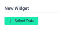
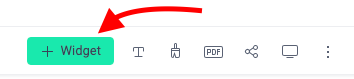
Adding a Widget
To add a new Widget or data visualization when you are creating a new dashboard, click on the Select Data button:
To add a new widget on an established dashboard, click on the + Widget button:
Selecting Data
When you choose to Select Data when first creating a widget, you can either select a data value field or a column field. Selecting Data and then changing the chart type may clear your selection, so it honestly matters very little which data you first select until after you choose your Widget Type.
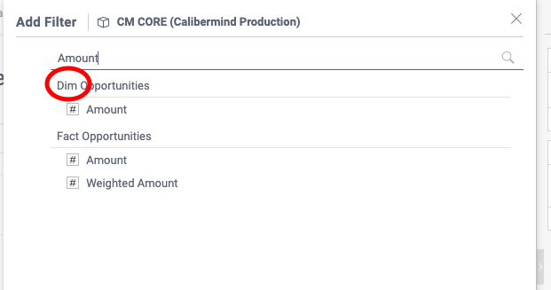
Field Selection Keys to Keep In Mind
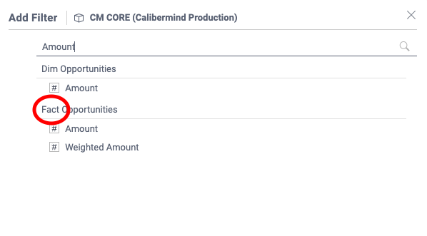
When to use DIM fields
Tables with a "DIM" prefix are Dimension fields. It's a naming convention we use at CaliberMind to denote fields that have been prepped for use as a way to summarize data. When it's time to choose between a DIM and FACT field, use a DIM field when you want to use the field for an axis, category, or filter.
When to use FACT fields
Tables with a "FACT" prefix are Fact fields. It's a naming convention we use at CaliberMind to denote fields that are in their original data state. When it's time to choose between a DIM and FACT field, use a FACT field when you want to add, count, subtract, divide, or make some kind of formula field with the data.
Choosing a Widget Type
There are several Widgets or data visualization types to choose from. After you've selected your initial data point, you may click on a short selection of suggested report types:
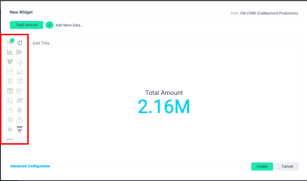
Alternatively, you can click "Advanced Customization" to see all of your options:
Creating a Calculated Field
When you Select Data, you have the option of selecting the Function icon to build a calculated field:
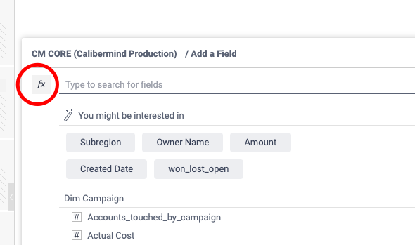
Formula fields are a combination of functions and fields.
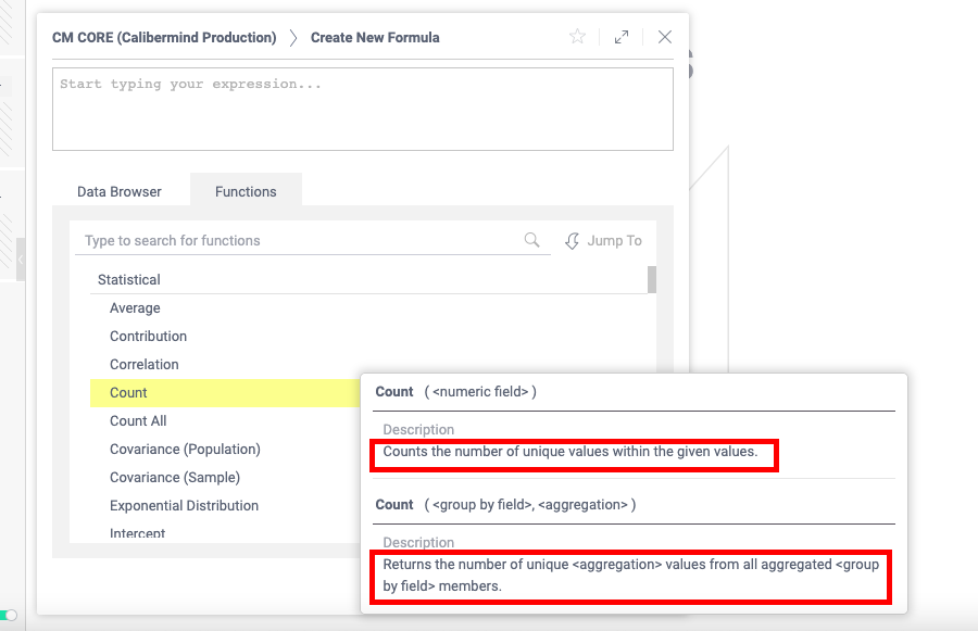
Functions
The list of functions shows you what logic arguments are available in formula fields. If you hover over a field, it will give you the description, such as whether or not distinct items are considered or limitations in logic:
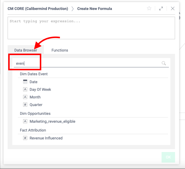
Data Browser
The data browser functions similarly to the Select Data option. Type the beginning of the field you want to find or the table name to perform a search. Less letters are more in the case of this search functionality.
Changing a Label
To change a data element label in a Widget, edit the Widget, click on the ellipses, and Rename the component:
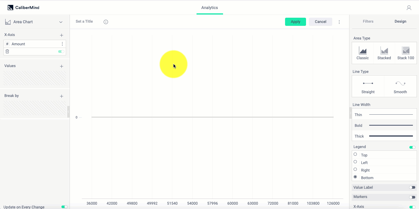
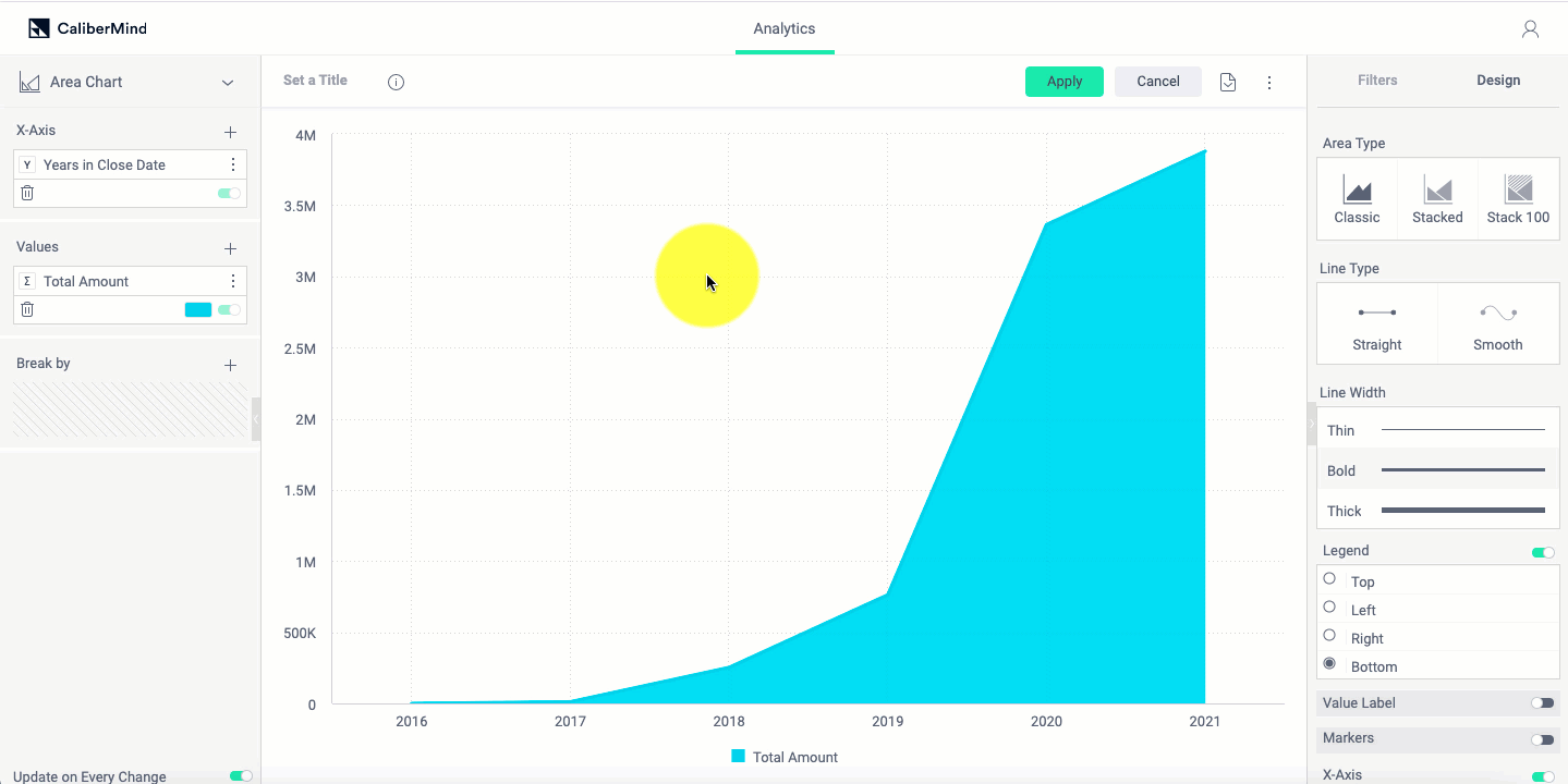
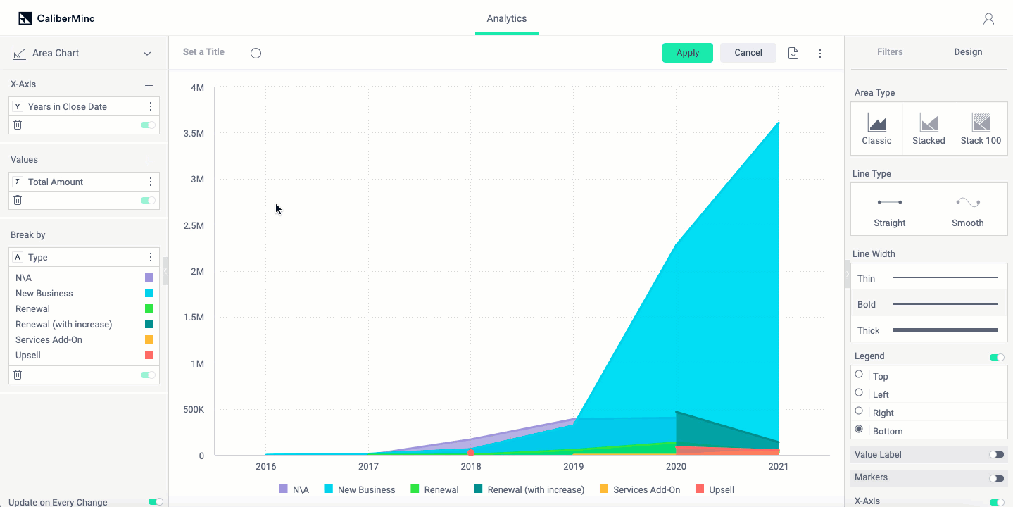
Adding Categories or Groupings (X-Axis and Break By)
To view the data by another dimension (for example, adding an x-axis for Date), select a chart type visualization and add a summarizable field to the X-axis:
To add categories or Breaks, Add a field to Break By:
You can change how the data is displayed by clicking on "Design" and selecting a grouping Type:
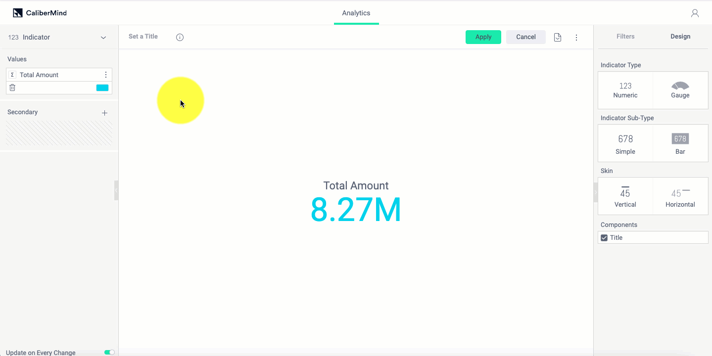
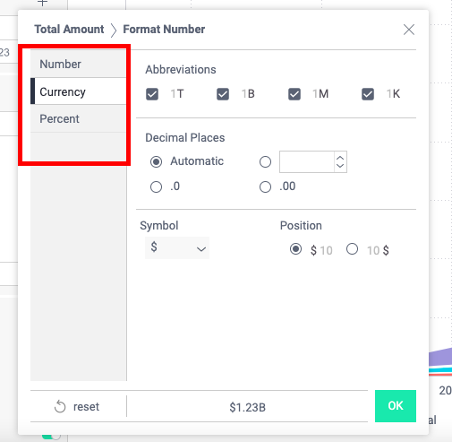
Changing the Format of a Number Field
Fields like Opportunity Amount and Weighted Amount default to plain number displays. To change the number format of a field (for example, to Currency), hover over the widget component and click on the number or letter icons:

From there you can choose the type of display format:
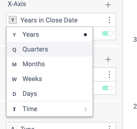
Changing the Format of a Date Field
To change how a date field aggregates or groups, click on the timeline symbol to the left of the component name:
Then select the desired grouping:
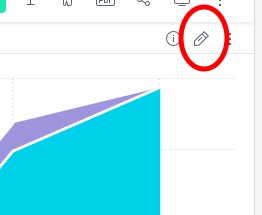
Changing a Widget
You can change the Widget type, field values, or groupings of any Widget on your custom Dashboard at any time. Simply select the pencil or Edit icon on the Widget:
Dashboard Filters vs. Widget Filters
Dashboard level filters should be used when you are displaying data from the same objects and want to apply a universal filter. For example, if you are looking at a Pipeline Creation Dashboard, you may want to narrow the time period by Opportunity Create Date or filter Opportunity Type by New Business.
If you only want to filter a specific component on your dashboard, for example, you want a Won opportunity component on a Pipeline Creation dashboard that otherwise shows open, won, and lost data, use a Widget Filter.
If you combine data from multiple objects or want to look at a time range using different fields, you may need to use Widget specific filters in order to have the data display as expected. For example a Quarterly Review Dashboard may have a Bookings Opportunity Widget that is filtered by Close Date and a Pipeline Created Widget that is filtered by Create Date.
Adding Text Components
A Text Component gives you more control over the appearance of text on your dashboard. Default dashboard titles are small, and using a Text Component allows you to make the purpose of the dashboard stand out.
Removing Widgets
To remove a widget, click on the three ellipses and click Delete:
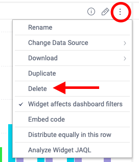
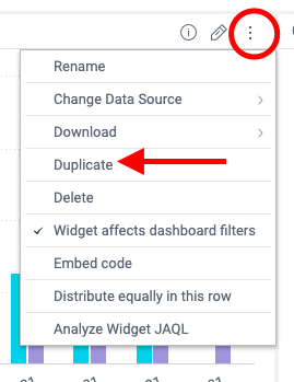
Duplicating Widgets
To duplicate a widget, click on the three ellipses and click Duplicate: